Updated Material Design Guidelines and Resources
When we
first
published the
Material
Design guidelines back in June, we set out to create a living document that would
grow with feedback from the community. In that time, we’ve seen some great work from the
community in augmenting the guidelines with things like
Sketch
templates,
icon
downloads and screens upon screens of
inspiring
visual and motion design ideas. We’ve also received a lot of feedback around what
resources we can provide to make using Material Design in your projects easier.
So today, in addition to publishing the
final
Android 5.0 SDK for developers, we’re publishing our first significant update to the
Material Design guidelines, with additional resources including:
- Updated sticker sheets in PSD, AI and Sketch formats
- A new icon library ZIP download
- Updated color swatch downloads
- Updated whiteframe downloads, including better baseline grid text alignment and
other miscellaneous fixes
The
sticker
sheets have been updated to reflect the latest refinements to the components and
integrated into a single, comprehensive sticker sheet that should be easier to use. An
aggregated sticker sheet is also newly available for Adobe Photoshop and
Sketch—two
hugely popular requests. In the sticker sheet, you can find various elements that make up
layouts, including light and dark symbols for the status bar, app bar, bottom toolbar, cards,
dropdowns, search fields, dividers, navigation drawers, dialogs, the floating action button,
and other components. The sticker sheets now also include explanatory text for elements.
Note that the images in the Components section of the guidelines haven't yet been
updated (that’s coming soon!), so you can consider the sticker sheets to be the most
up-to-date version of the components.
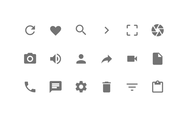
Also, the new
system
icons sticker sheet contains icons commonly used in Android across different apps,
such as icons used for media playback, communication, content editing, connectivity, and so
on.
Stay tuned for more enhancements as we incorporate more of your feedback—remember to share
your suggestions on
Google+! We’re
excited to continue evolving this living document with you!
For more on Material Design, check out these
videos and the
new getting started guide for Android developers.
Posted by
Roman Nurik, Design
Advocate
