Visualizing airport delay correlations with Google BigQuery and Maps API
 By Josh Livni, Maps
Developer Relations Team
Cross-posted with the Google
Geo Developers Blog
By Josh Livni, Maps
Developer Relations Team
Cross-posted with the Google
Geo Developers Blog
Last week
Felipe and
Michael from the Google
Cloud Platform Developer Relations team released
a video demonstrating the new
Pearson
correlation analysis available in Google
BigQuery. Their example used more
than 70 million flight records to find correlations on departure times, which could be used to
predict whether your plane would be late. Specifically, you can find out which set of airports
best predict your airport’s possible flight delays the following day.
As you can see from
their code (watch the video for context), they’re
using
iPython
Notebook to work with the BigQuery results, and
matplotlib to get a quick visual of results. But
one aspect that’s hard to see in these results is the spatial relationship of the airports.
Maps to the rescue!
My goal was to create a simple visualization, where selecting any airport would
highlight which airports you should look at to predict delays the next day. Using the
Google Maps JavaScript API I went ahead and did
just that:
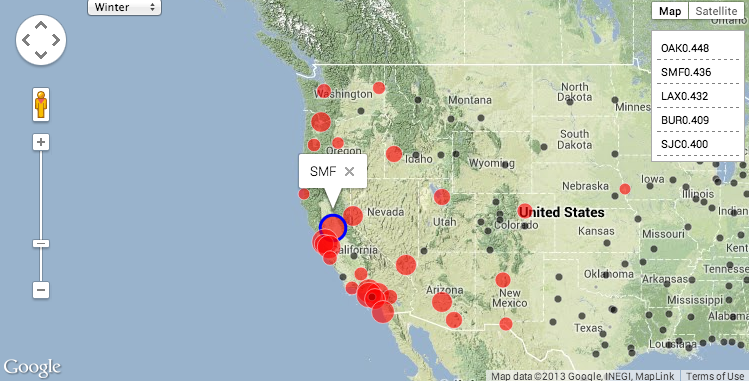
To create this map, using the same code noted above, we first created a JSON dump
of the correlations on departure time for each airport to each other airport. Then, using an
article on
visualizing
earthquakes as a template, I modified the code so that we have a simple dictionary
of all airports, keyed by their airport id. Last but not least, I added a function that gets
called when an airport marker is clicked in order to restyle all the other airport markers
according to their correlation. This method checks the selected season (winter, for example,
has different correlations than spring), and highlights correlated markers by setting the
color and scale of the circle symbol.
Thanks to BigQuery, running complex correlations over billions or trillions of
attributes is surprisingly easy. But don’t forget if your data does have some spatial
component, a quick mapping visual can add some great context to your
results.
Josh Livni works
with maps at Google, where he helps developers tell compelling stories using the Google Maps
APIs. As you read this, he's probably writing code, thinking about snowboarding, or both.
Posted by Scott Knaster,
Editor
