A
good chart can tell a story, such as depicting when you get home on Saturday night by plotting
your tweet patterns along the week.
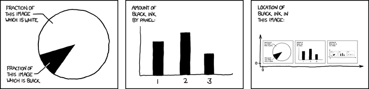
A good chart can take an
elusive concept and clarify it in a visually appealing manner. This ingenious XKCD
strip uses a pie chart, a bar chart and a recursive scatter plot, to demonstrate the
concept of self description.
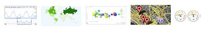
Whether you need a simple line chart, an interactive Geo Map or a complex Motion Chart , Google can help you add live charts
to your web page using our Chart and Visualization APIs.
Both of these APIs are free and simple to use, however they each have distinct
advantages: 1. The Chart API provides Image Charts which
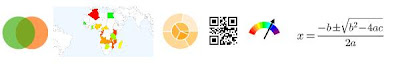
are rendered by a Google chart server in response to a simple URL request. Image Charts are
fast to render and can be easily emailed and printed. In addition to the extensive gallery of charts, this server now also provides dynamic icons, QR codes, and math formulas.
2. The Visualization API provides
Interactive charts which are rendered on the browser using a Google
developed JavaScript library. Interactive charts trigger events, providing tool-tips and
animations. In addition to a rich gallery of charts, this tool can also read
live data from a variety of data sources such as Oracle PL/SQL or Google spreadsheets.
We have discovered that developers occasionally need some help in
navigating between the many options and distinct advantages of Image Charts and Interactive
Charts, and therefore decided to bring the two APIs under one new framework which we call the
"Google Chart
Tools". We've accordingly renamed the APIs to
Image Charts API and Interactive
Charts API and created a simple side-by-side comparison page which you might find useful in
choosing which chart tool is better for you.
Image Chart: Oceans of the
world
Interactive Chart: Oceans of the
world
We hope to meet you in person at Google I/O this May. In our Google Chart Tools I/O session we plan to
present many of our new features including dynamic icons, which helped us plot our version of the
recursive XKCD chart below:
